Disclosure: This post may contain affiliate links, meaning we get a commission if you decide to make a purchase through our links, at no cost to you. Please read our disclosure for more info.
Last Updated on January 24, 2017 by Work In My Pajamas
People are looking for infographics more than ever, with Google seeing over an 800 percent increase in searches for infographics the last few years. Unfortunately, not all of those infographics are as high quality as they could be. Here are four common mistakes to avoid in your own infographics:
- The Flow Is Off
Your infographic should flow from one point to the next. Your reader’s eyes should be drawn from Point A to Point B and so on. This means you need white space and visuals that lead your reader in the right direction (such as arrows, lines, etc.). You should also have a nice balance of graphics and text.
Examples:
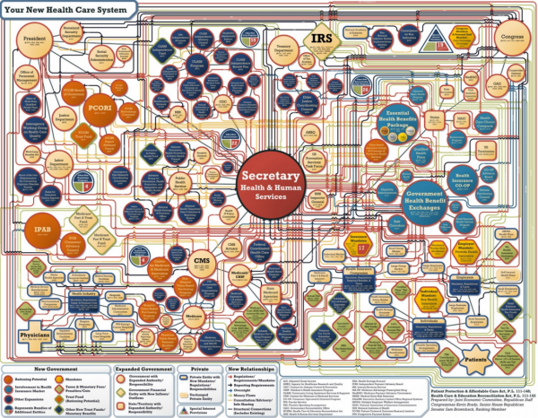
Bad flow
What is going on below? The average person hardly knows where to start with the web of never ending circles. In addition, there are so many of those circles that it can be very easy to lose your place and have to start at the beginning. Sure there is a key at the bottom, but most readers will be long gone before they notice the key, and it isn’t much help in deciphering this layout.
[http://visual.ly/your-new-health-care-system]
Good flow
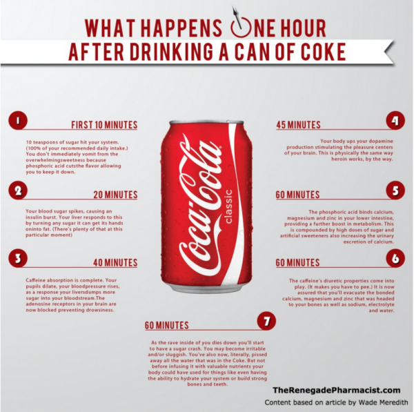
By contrast, this infographic created by The Renegade Pharmacist shows clearly in what order you should read the infographic by using a simple left to right set up as the eye is naturally drawn that way for English readers. Each point is numbered with a simple numeral to further clarify the flow of the infographic.
[http://therenegadepharmacist.com/what-happens-one-hour-after-drinking-a-can-of-coke/]
- Too Much Text and No Context
Most people are visual learners. About 65 percent of people learn best from images. Infographics are supposed to be a quick way to present information visually. One of the reasons they are so popular is because people like to be able to quickly scan and process the information.
However, too much text makes the infographic more like a blog post and that can be a real turn off to people who are expecting a quick, visual representation on the topic.
Examples:
Too much
The infographic below has way too much text. This really should have been a blog post instead of an infographic. Most people searching for an infographic will probably bounce away from this one.

[http://visual.ly/it-outsourcing-predictions-2012]
Just right
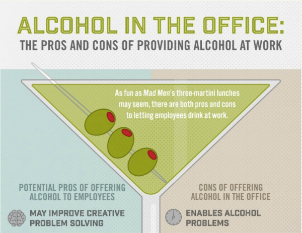
The infographic below uses a good amount of text, but it is laid out in a way that it flows naturally from one point to the next. By breaking the list into two columns and using subheadings, the reader can quickly scan over the main ideas and then read more info on the ones that capture their interest.
[http://www.clarityway.com/infographic/alcohol-in-the-office/]
- Information Overload
An infographic should be very focused and to the point. You probably remember writing research papers in high school and the teacher telling you to narrow your focus more. Instead of writing a paper about cats, you needed to write paper about how cats drink water.
Infographics are the same way. They need to be very focused on a short amount of information. Otherwise, they become too weighty and overwhelming for the format.
Examples:
Too much information
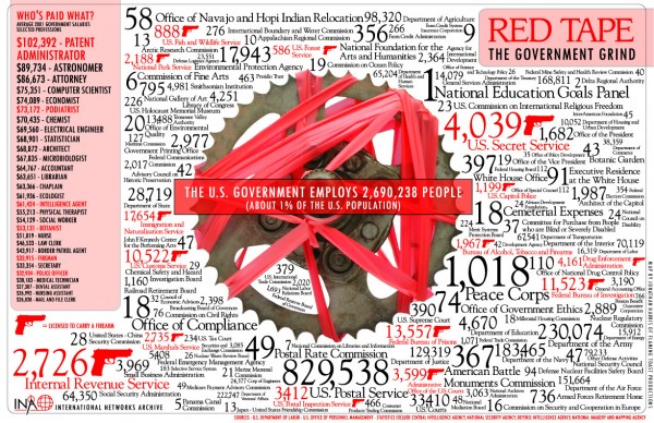
Okay, so the idea here is to illustrate how confusing and time consuming red tape can be. However, the infographic is so cluttered that the reader probably won’t get that point at first glance. The infographic would work better had they put a bit of streamlined info at the top and then stated clearly that below is what the red tape looks like when illustrated. Then, the reader would understand the point much better.
[http://www.princeton.edu/~ina/infographics/government.html]
Just the right amount of information
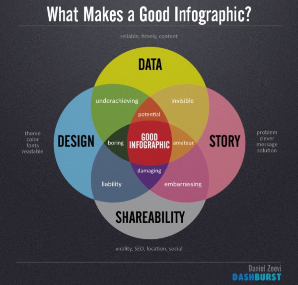
By contrast, look at this infographic with some simple circles and text. It is much easier to understand at a glance. Most people will take the time to read over this infographic and may even share with their own social media contacts or on their blogs.
[http://visual.ly/what-makes-good-infographic]
- Design Choices
It’s important to understand the concept of attractive design and typography that goes well together. Design is sometimes a matter of preference, but there are some designs that everyone hates, such as yellow on a white background.
Examples:
Unattractive design
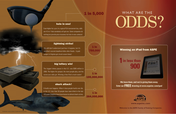
The outline of this design isn’t bad, but the colors just don’t work together. The text is hard to read. The iPad looks like it is a phantom, and the font looks somewhat fuzzy. Sharper contrasting colors would make this design look better, and the graphics shouldn’t have that hazy sepia color overlay.
[http://www.aspe-sdlc.com/blog/what-are-the-odds-of-winning-an-ipad/]
Good design
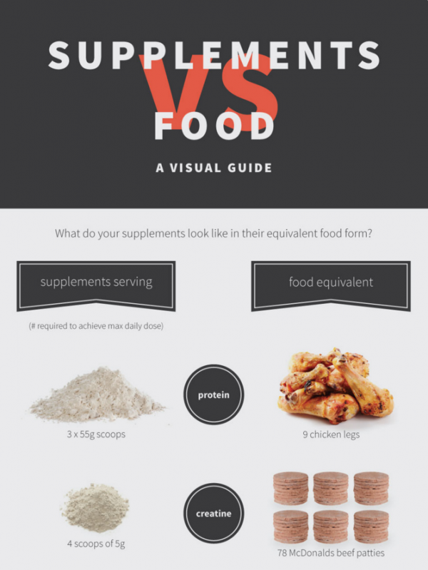
The below example has a similar design with just a couple of different colors used. However, in this case, the text has enough contrast that it is easy to read, and the font is crisp. In addition, the images of the food and vitamins are not filtered — they are clear and colorful.
[http://blog.supplementcentre.com/supplements-vs-food/]
There is a lot of thought that goes into creating an infographic that will resonate with readers. However, these are four common mistakes you now won’t make with your own infographics. Create and share away!

